MoodyGirl Chocolate: Packaging for a
Modern Period Brand
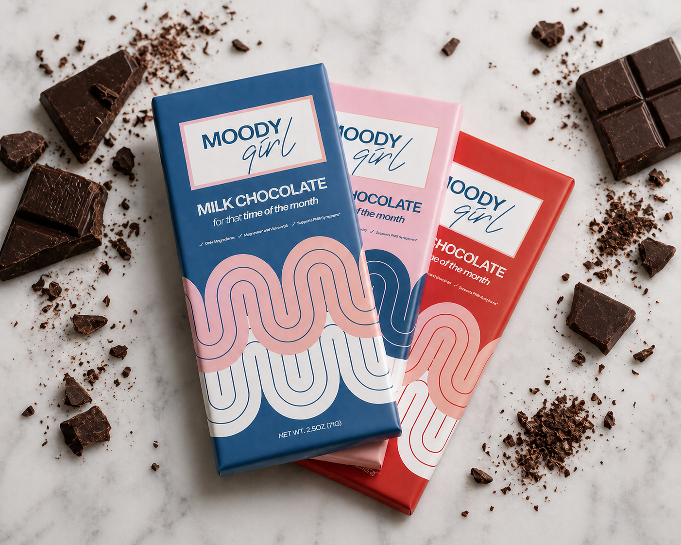
Packaging and branding design for a women-founded chocolate company created to support PMS symptoms with just three simple ingredients and added vitamins—blending feminine energy with a bold, spunky edge.
Where Feminine
Meets Bold
Challenge
The brand needed packaging that felt feminine and approachable without being overly soft or cliché. It also had to communicate a unique product concept—chocolate made for periods—while standing out in a saturated, visually competitive space.
Solution
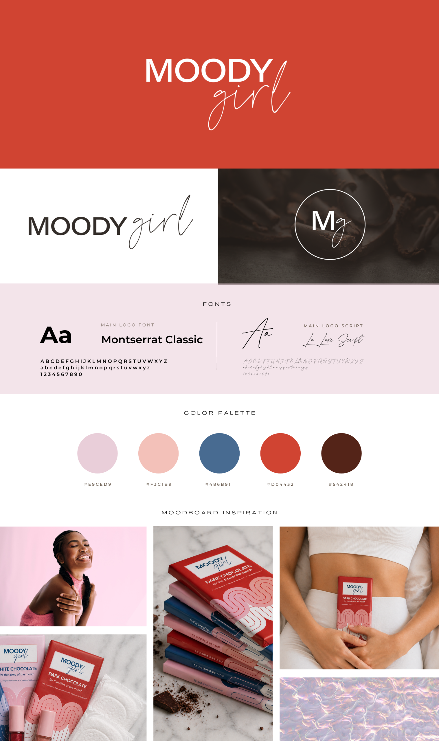
Using the provided logo and color inspiration, I created a bold, expressive design system that balances softness with attitude. Playful typography, curated color combinations, and intentional layout choices bring a “girly but spunky” feel to the packaging. The design highlights key messaging while keeping the overall look clean, cohesive, and easy to recognize across variations.
Impact
The packaging gives MoodyGirl a distinct, memorable presence that connects with its target audience. It clearly communicates the product’s purpose while capturing the emotional tone of the brand—supportive, relatable, and a little moody.

Tori Dahlberg
When the world is quiet, ideas come alive. Each piece here reflects countless hours of curiosity and creative energy.