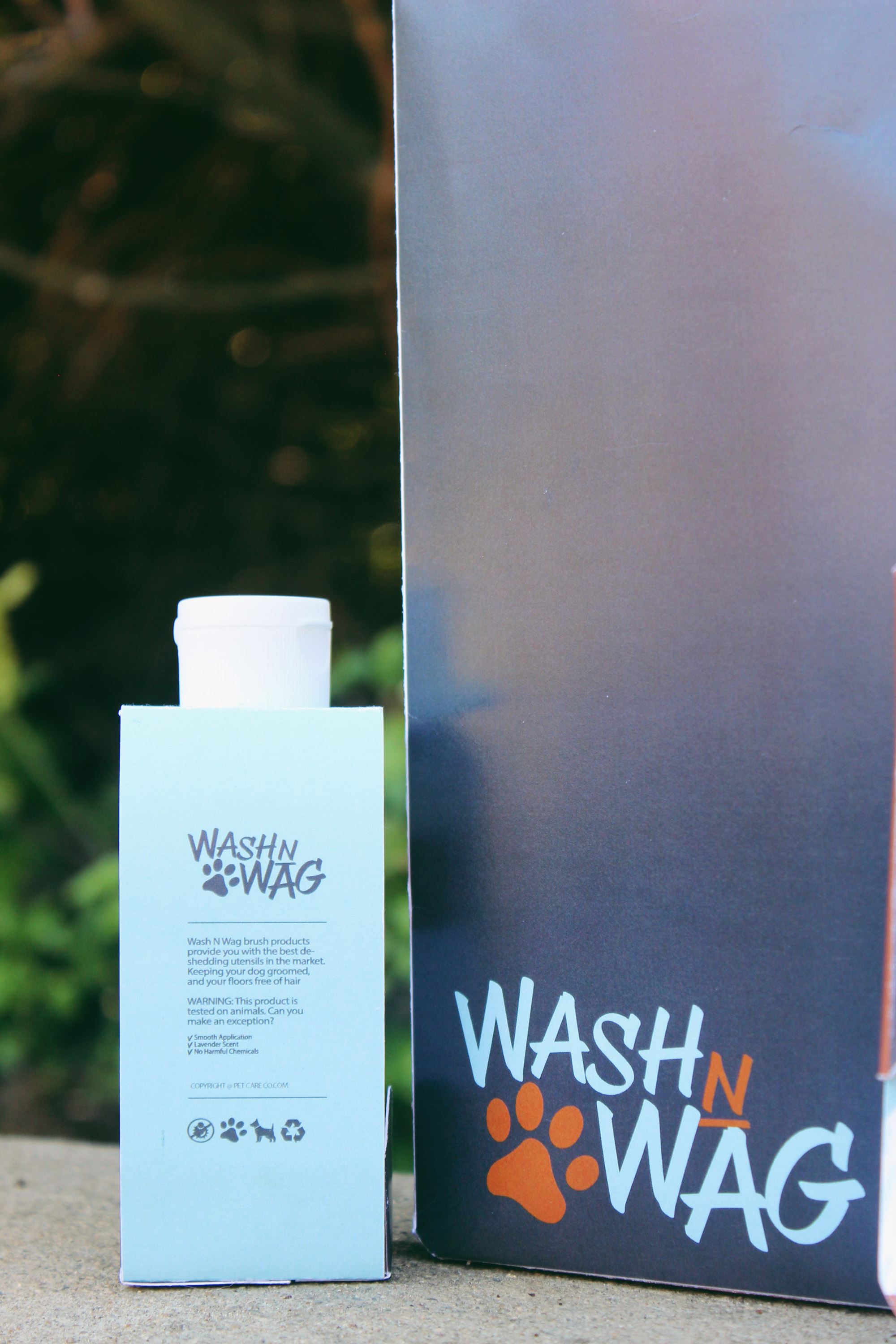
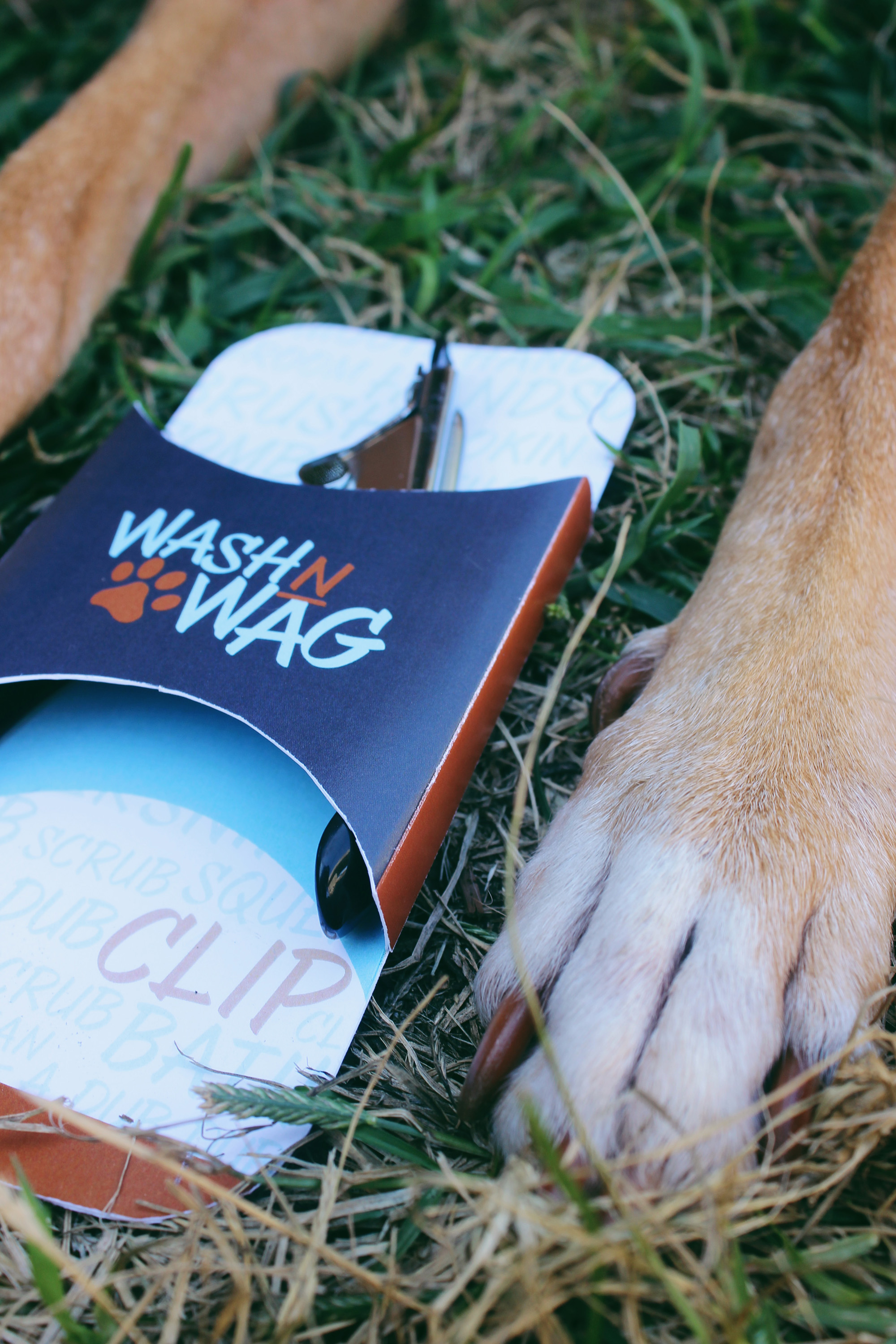
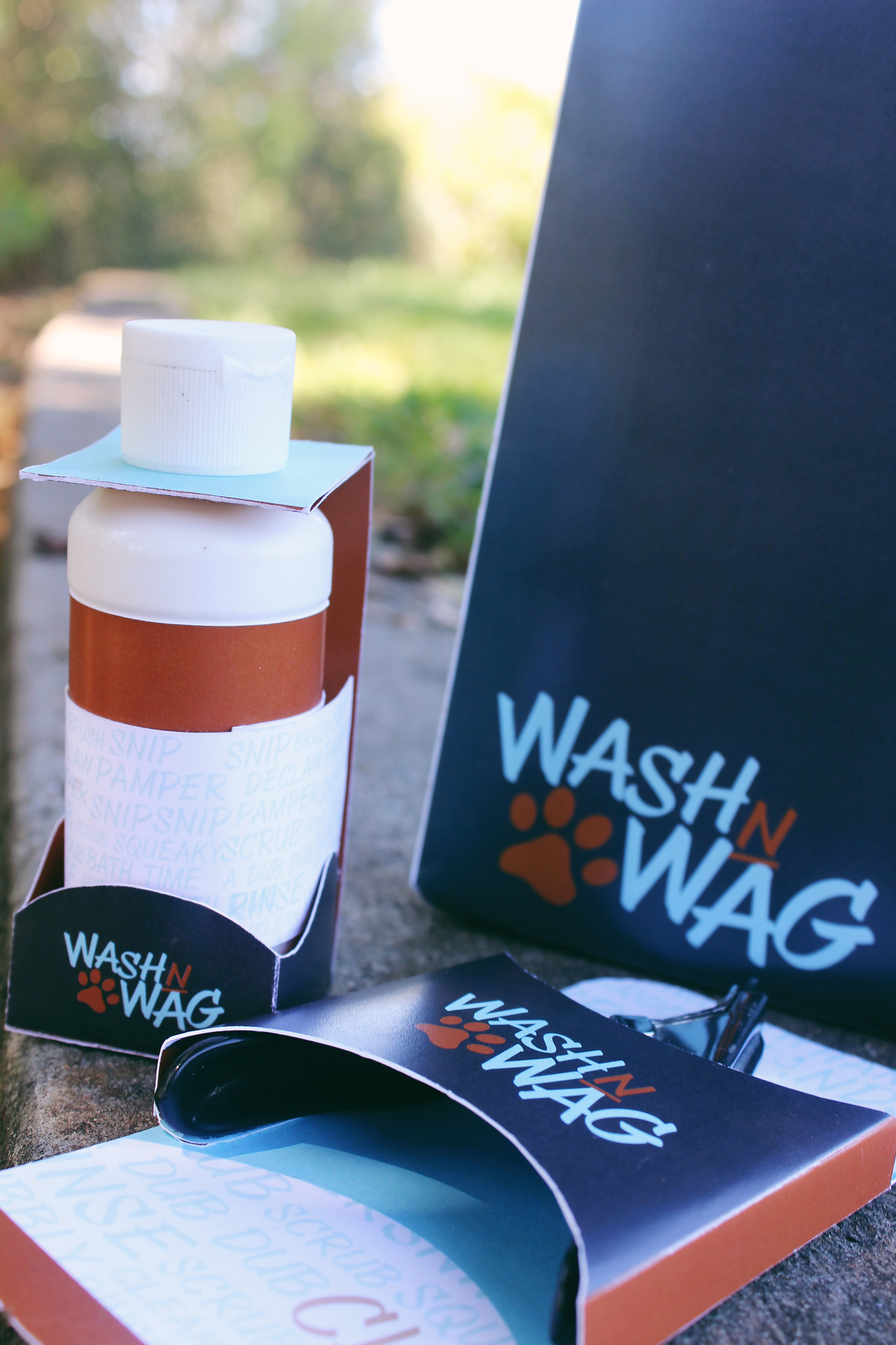
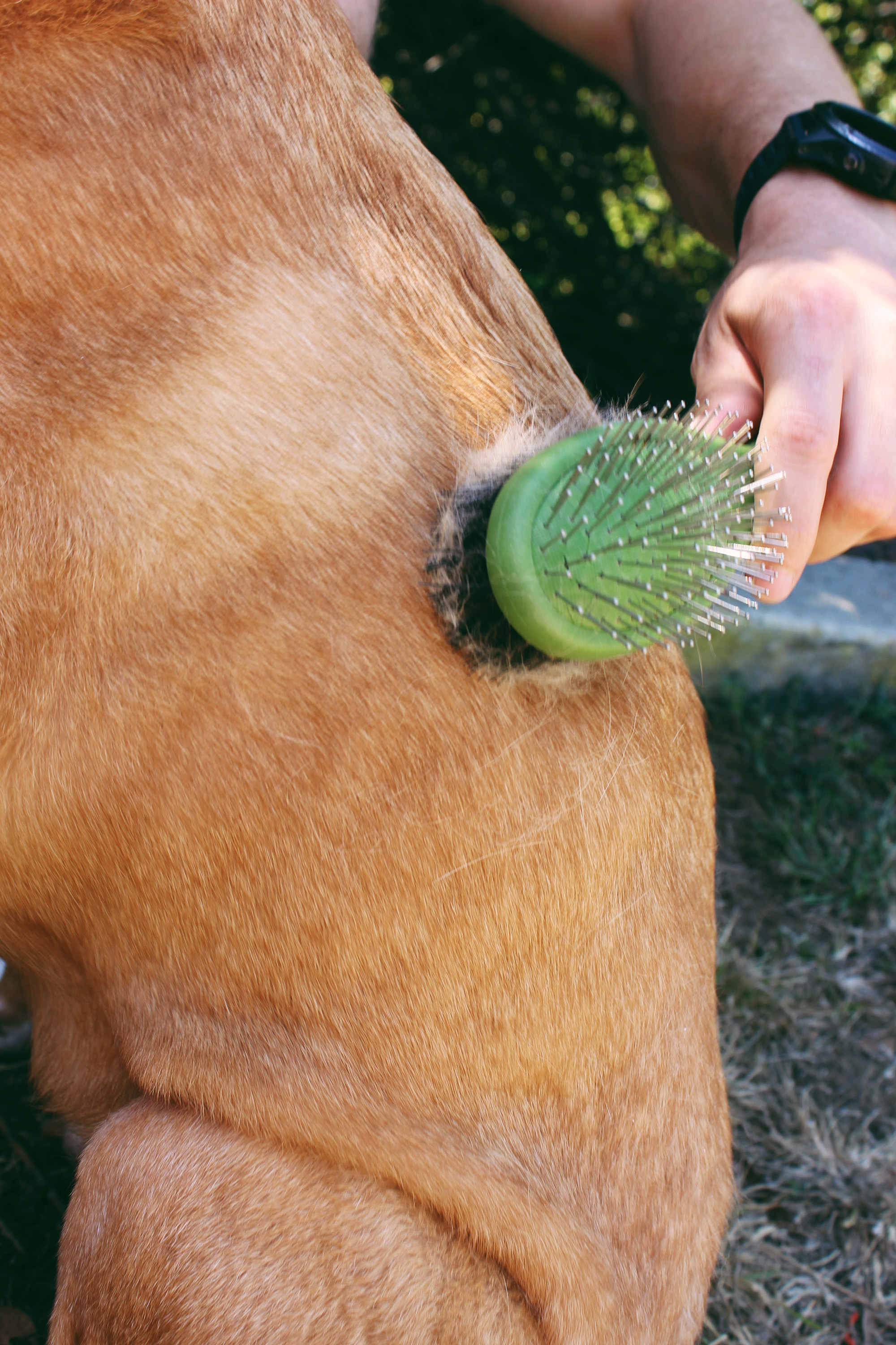
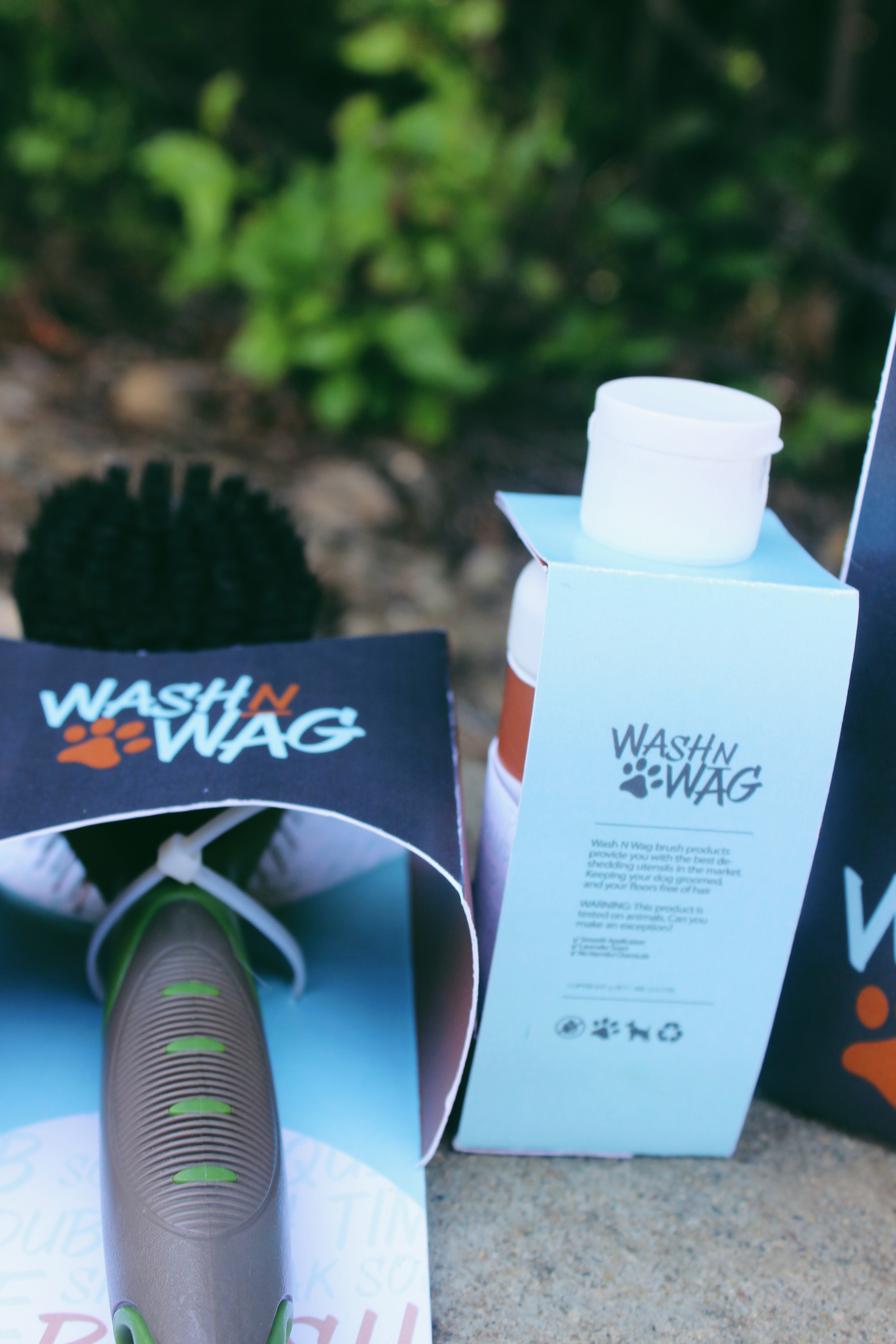
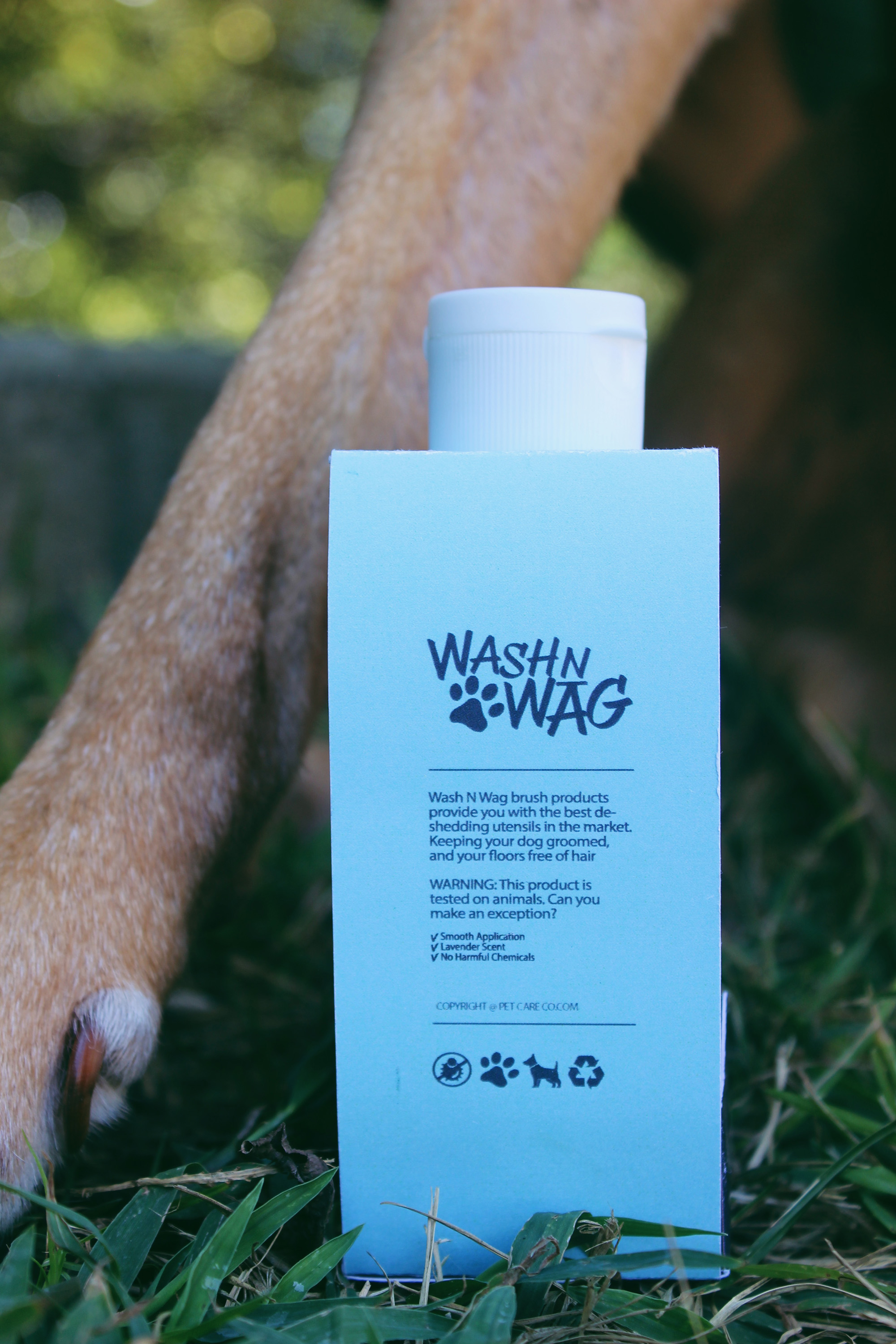
Wash N Wag is a product line for dog grooming products. I created this project in hopes of unifying a set of items needed for a quick grooming session. Items included are shampoo, nail clippers, and a hair brush.
LOGO
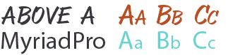
For the main logo, I wanted a playful chicken-scratch style typeface. AboveA cooperated when moved around and closer to other letterforms. The rest of the brand uses MyriadPro, a simple serif font to unify the whimsicalness.
TYPEFACE
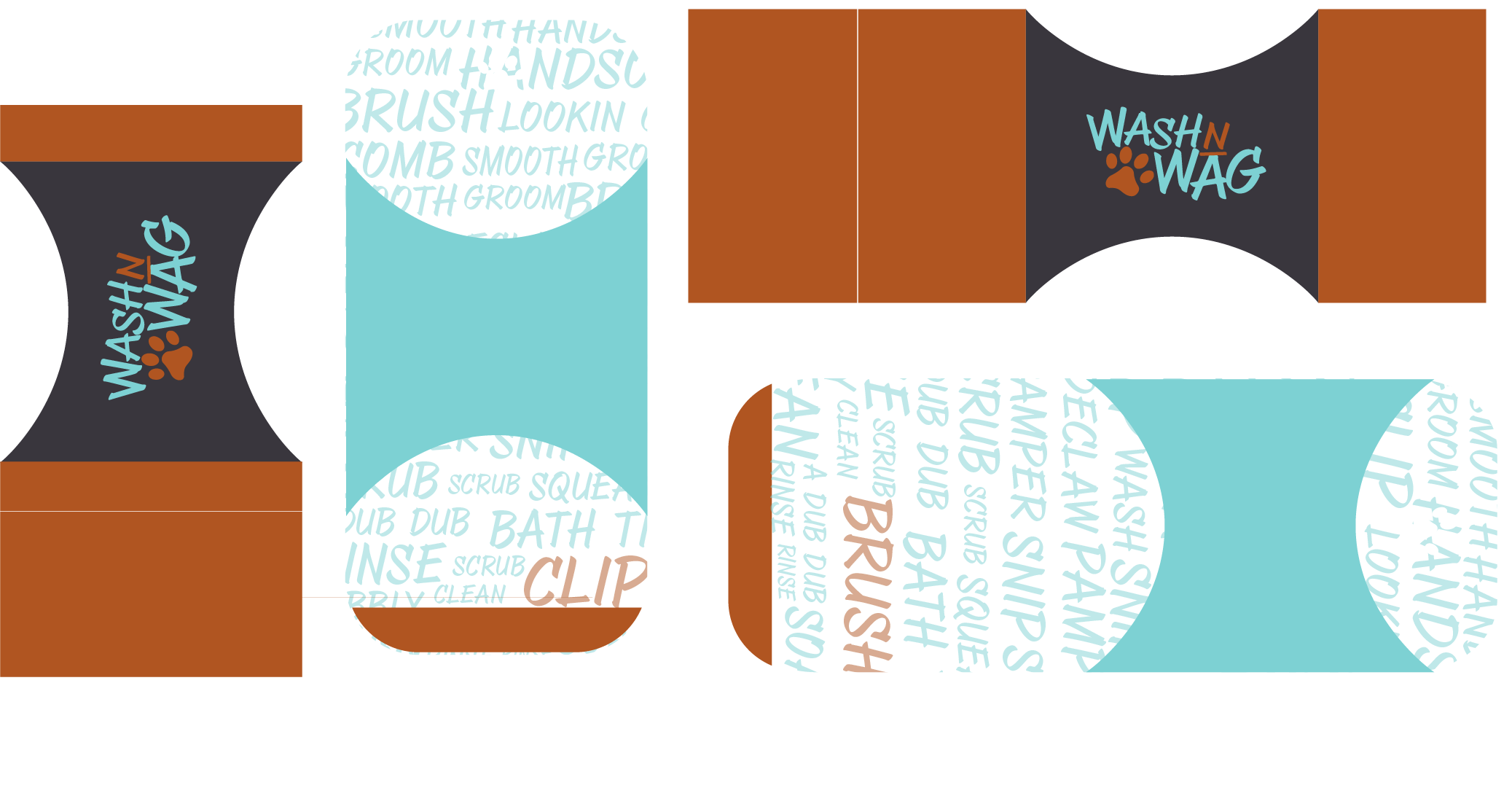
For these products, I wanted the the brush and the nail clippers to be hanger-friendly, and the shampoo packaging to work around the natural shape and cap and sit on a shelf with other related liquid products.
COLORS
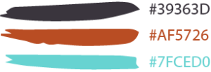
The color palette I chose for this brand is a perfect whimsical/playful palette. I wanted to include some sort of brown for the fur, black for the paws, and a bright blue to represent the collar.
PACKAGING
For this project, I wanted the brush and nail clippers to be packaged in the same way; a solid back piece and a wrap around cover with the logo centered.
As for the design, I stuck with blocks of color, and a pattern for the background to allow for some white space, as well as give it a more typographic, whimsical look.
Take a Hike is geared towards beginner outdoor enthusiasts. The ideal audience is someone who needs a little push to get outdoors and begin their hiking, camping, and backpacking aspirations.
LOGO
For this logo, I wanted the title to be catchy and involve a tree to appeal more to the eye. The tree represents the “A” in “Take a Hike” and represents both imagery and typography. I created a square with the words so that it could be nicely scaled down to any size.
TYPEFACE
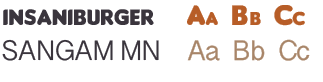
The typeface I used for the main logo “Take A Hike” is with Insaniburger. I chose this font because when it is in all caps, it creates an even square/rectangle with whatever amount of letters are in the word.The rest of the type on the packaging uses Sangam MN of different weights.
COLORS
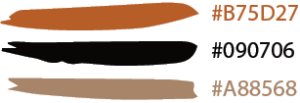
For this color palette, I chose a rusty orange, black, and different shades and opacities of a light brown. I thought these were very woodsy colors that would look clean with the simple design I had in mind for the packaging.
PACKAGING
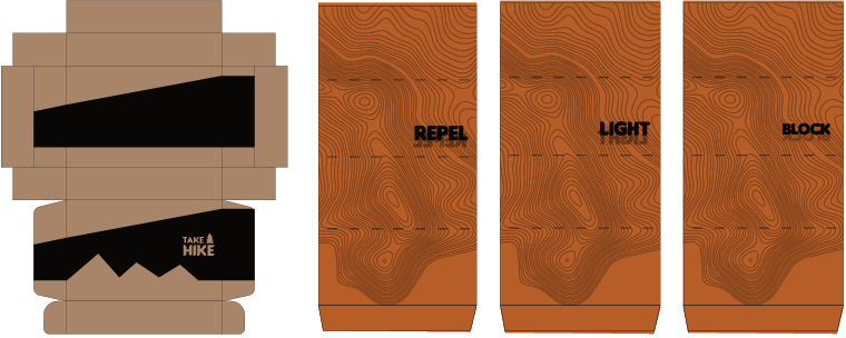
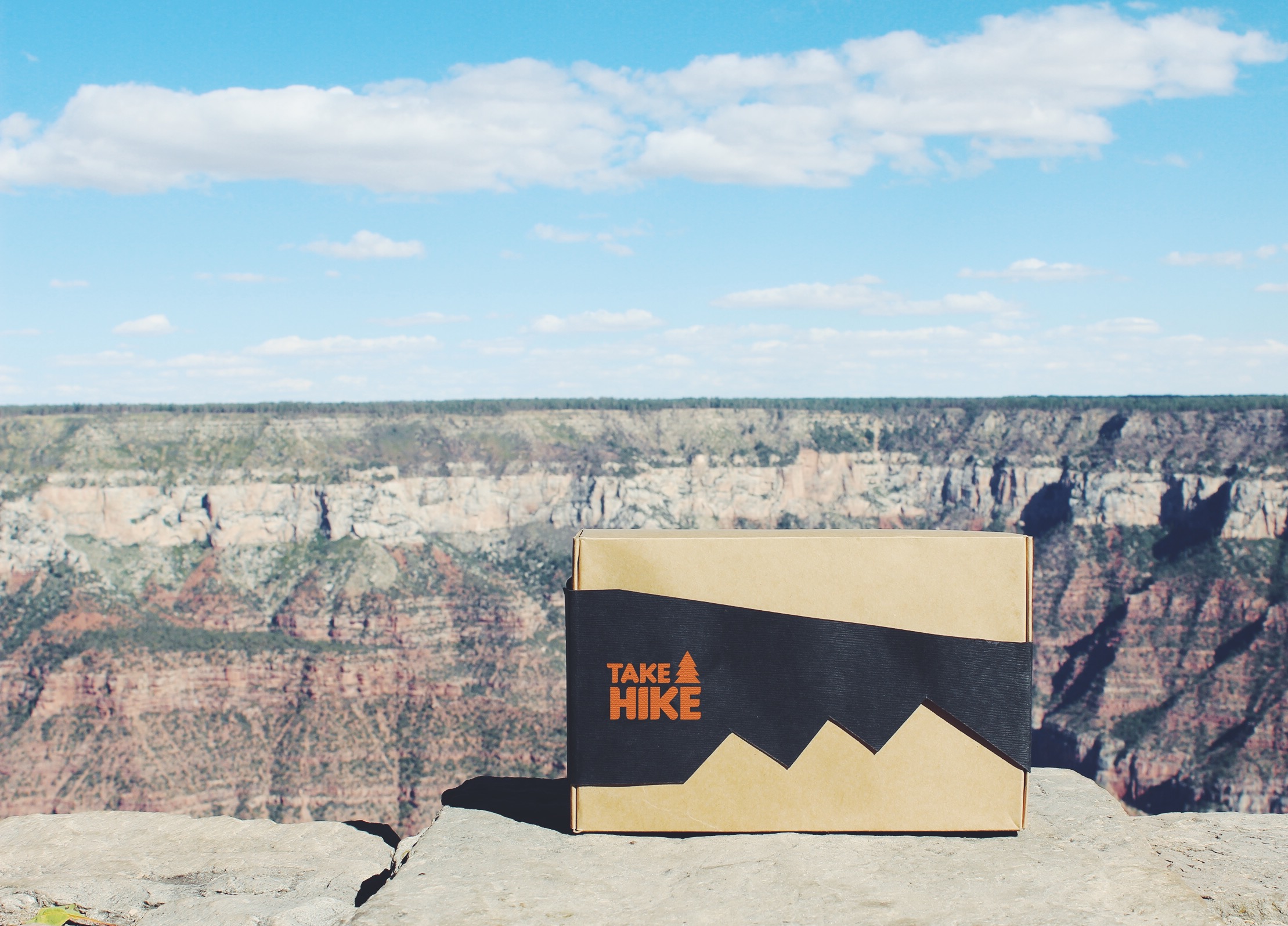
Fo the main containing box, I chose to keep it simple and brown with a slip sleeve over it. The idea was to create a silhouette with the contrasting black and brown, to match the outdoor hiking theme.
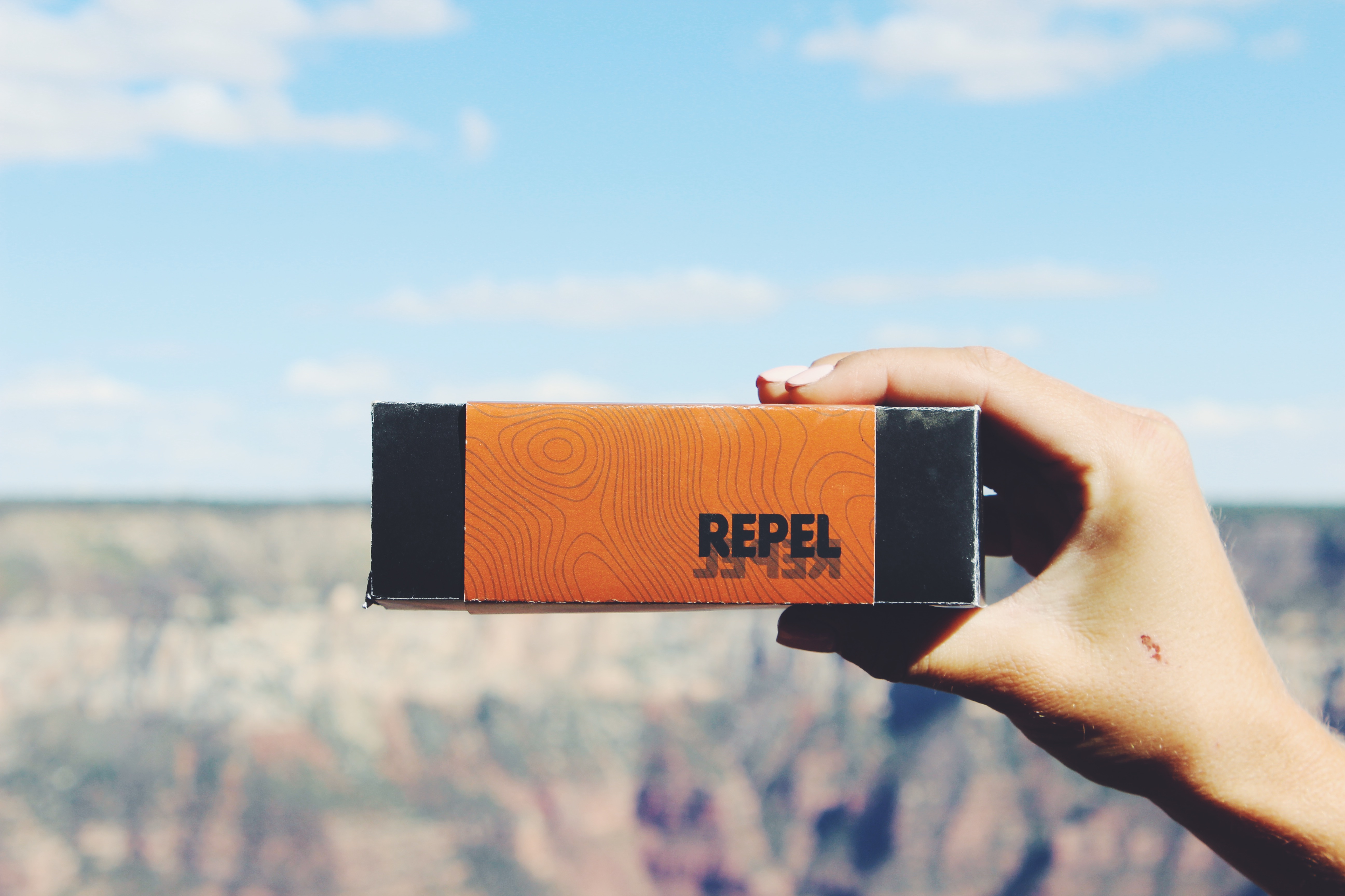
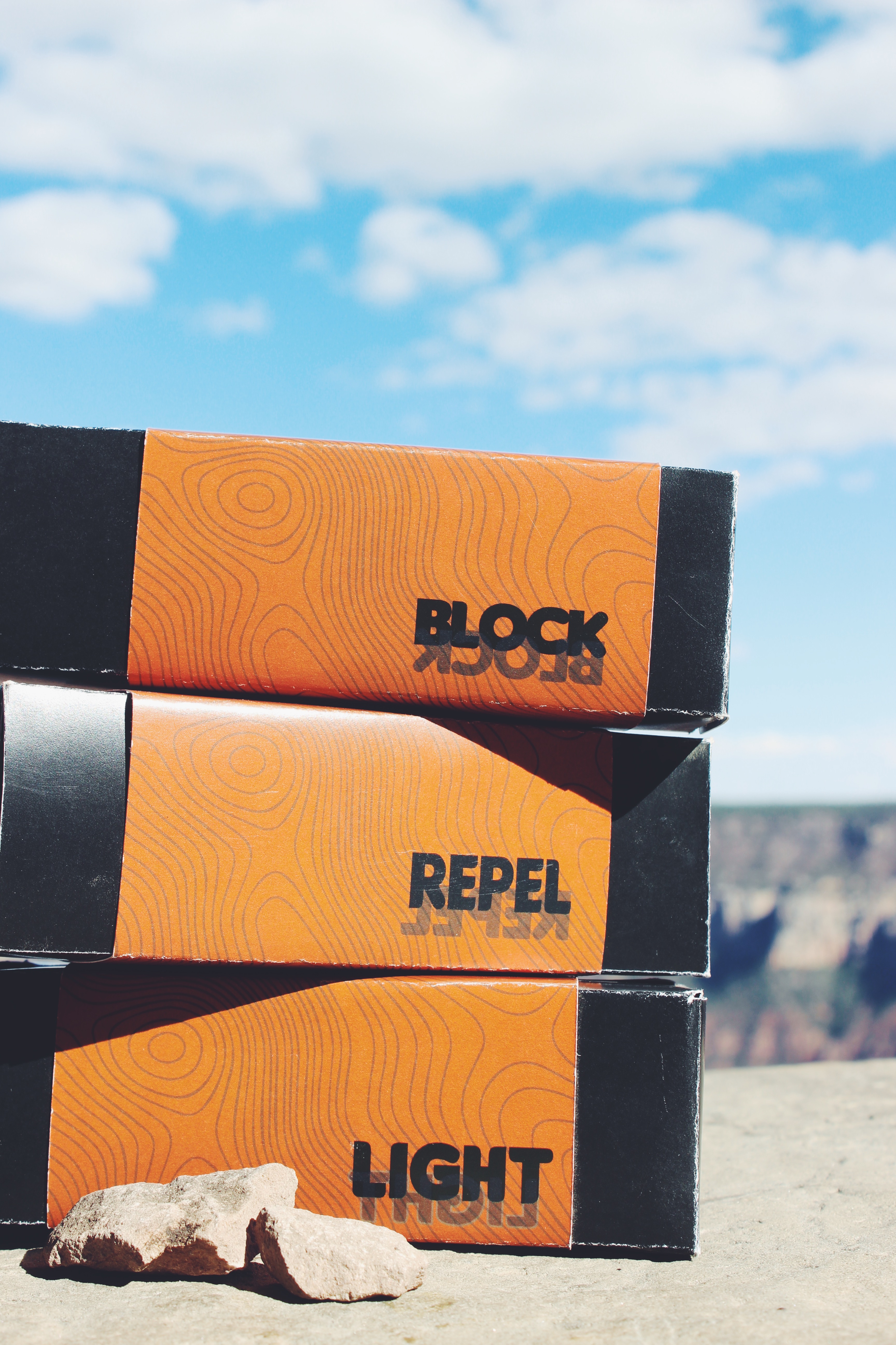
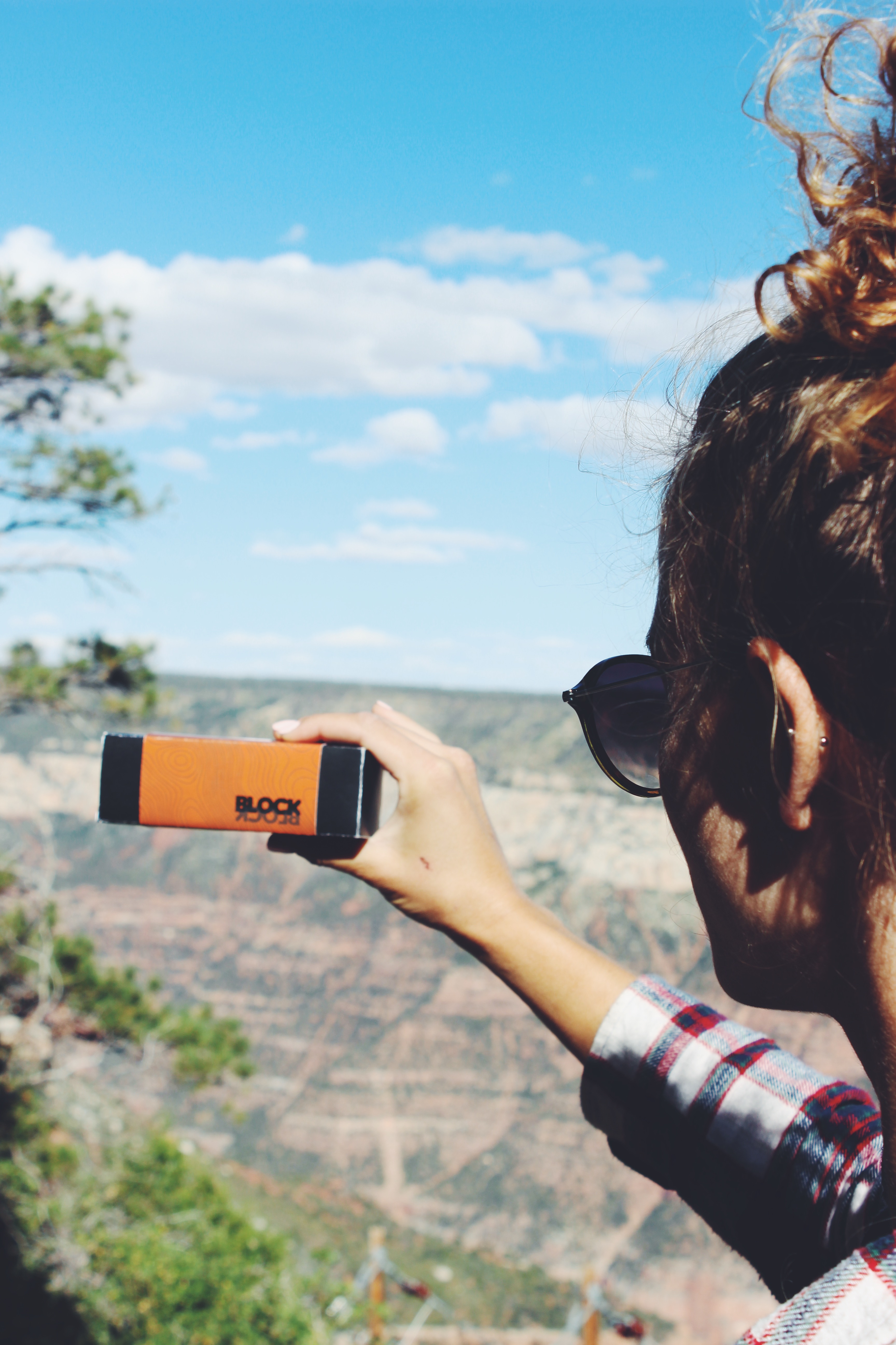
For the inner content, I stuck with a very minimalistic look. The rectangular boxes are in all black, with an orange slip cover indicating the content with a single word. The texture used is a topographic map.
Processed with VSCO with f2 preset
Processed with VSCO with f2 preset
Processed with VSCO with f2 preset
Processed with VSCO with f2 preset
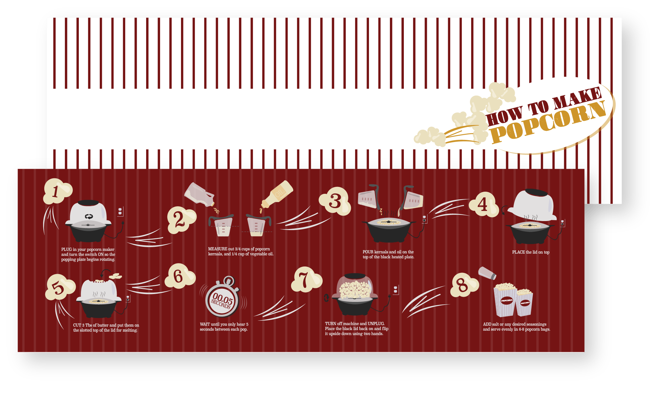
This is a How-To book for kids aging from 10-12. Making popcorn the more old fashioned way is becoming more and more rare. What better way to bring it back than with a little illustrated step-by-step book to have while you get ready for movie night.
ICONS
For smaller details, I used a 1pt stroke. The most typical and old fashioned movie theaters involved deep red velvet covered seats, and gold detail everywhere else. I chose to go with these colors to fit that theme and communicate a classic cinema feel.
TYPEFACE
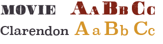
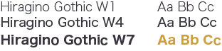
The typefaces I chose for this book were Movie Poster, and Super Clarendon. These were both very fun themed typefaces that I came across that fit the entertainment style I was going for when creating this book. The steps and main text is using Super Clarendon and the title uses Movie Poster.
COLORS
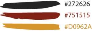
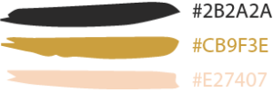
The color palette I chose goes along with an old movie theater theme. Old theaters would typically have red velvet seats, carpets, and gold detail everywhere. The gold color also represents the buttery popcorn, which is the main item in this book.
LAYOUT
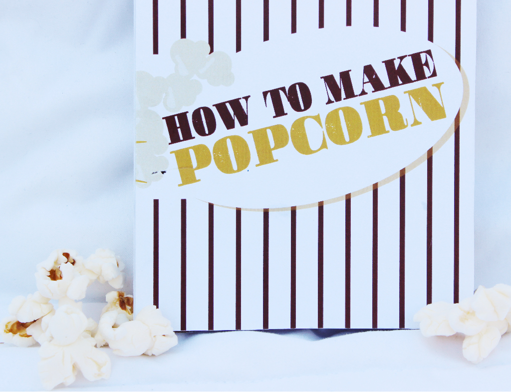
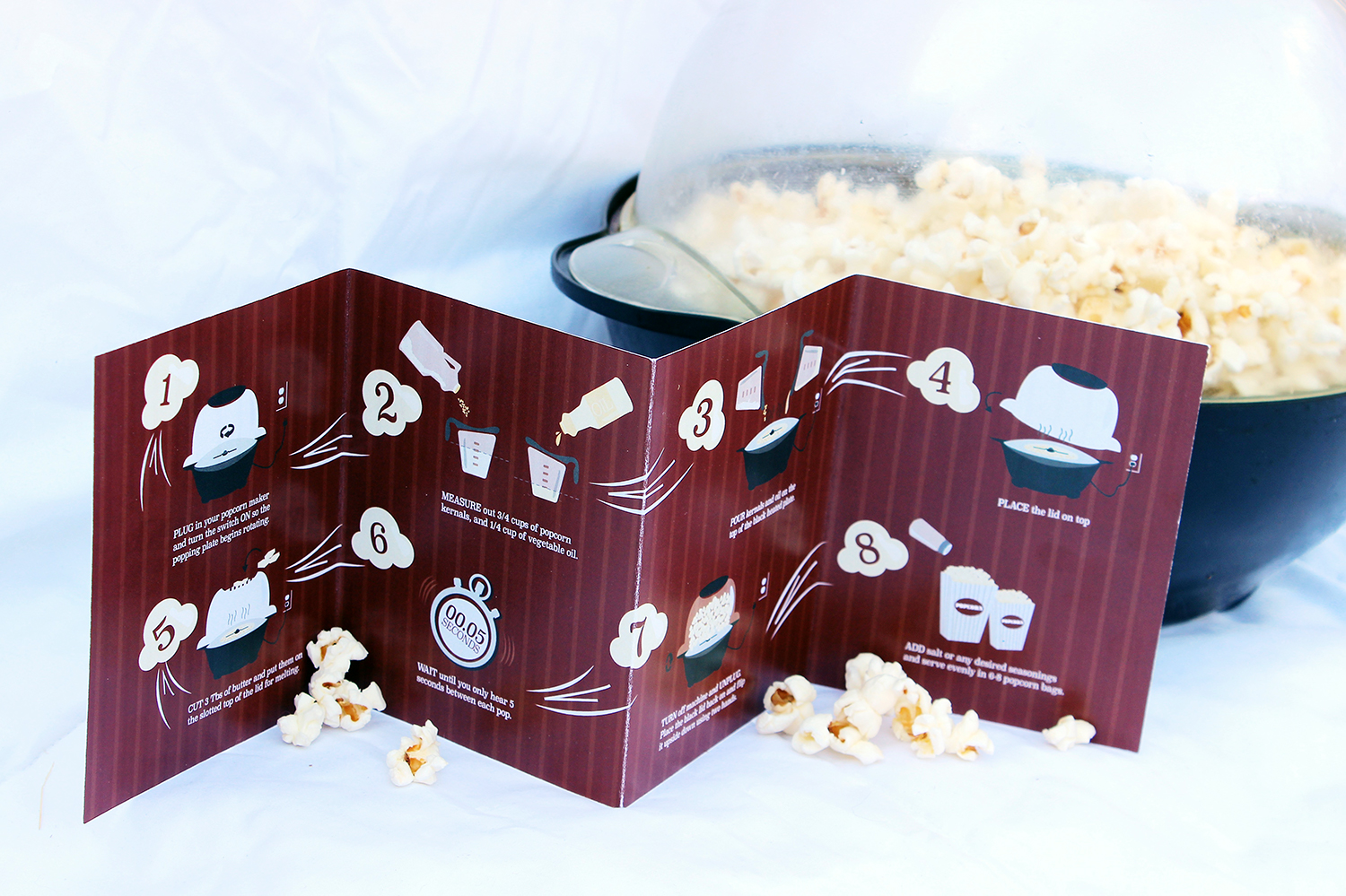
For this book layout, we had to create an accordian fold booklet that would appealing to a specific audience. To go along with the movie theater theme, I created the outside to mimic a paper popcorn bag with plain white and red pinstripes.
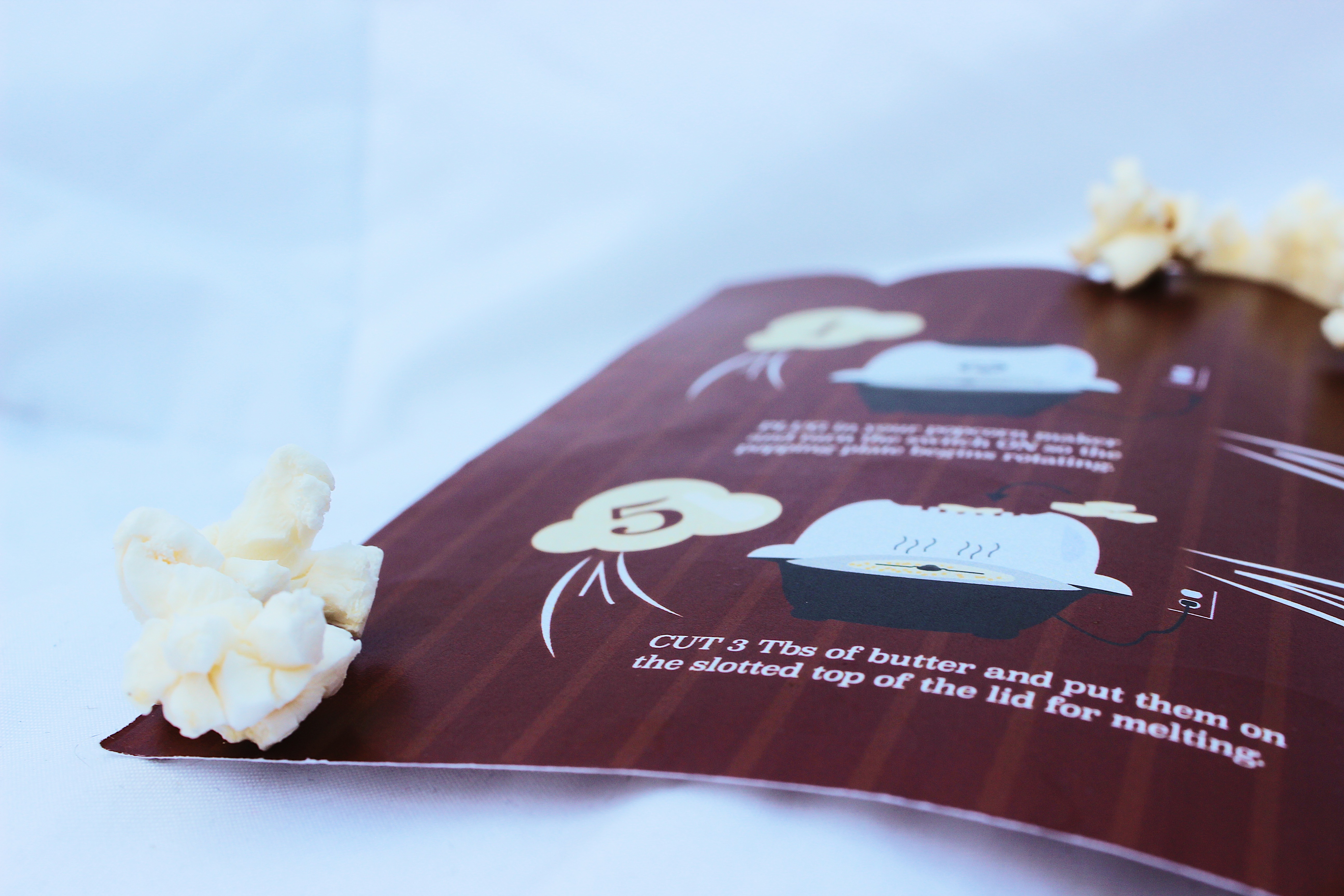
For the inside, I created a step-by-step infographic to guide the reader through the process. I incorporated numbers with the popcorn illustration, as well as little action marks to show movement throughout the page.
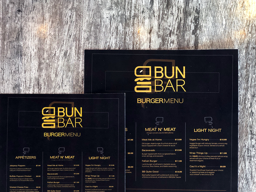
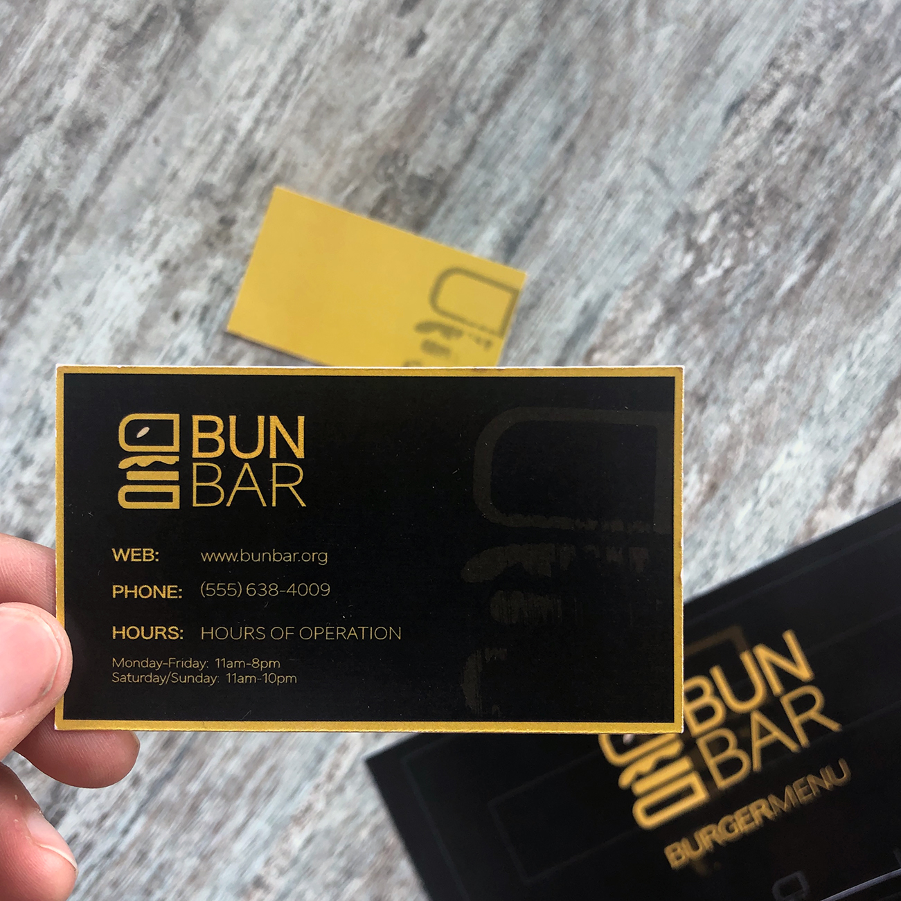
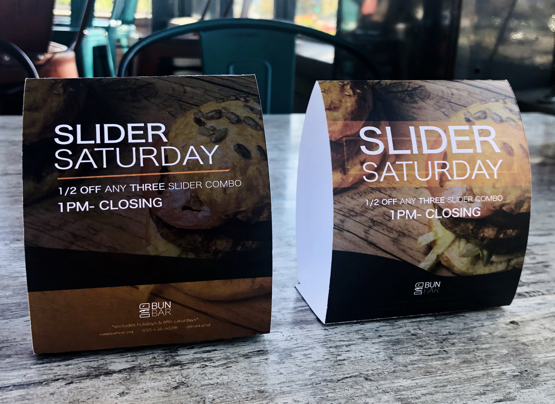
BunBar is a organic-based burger bar that I created and branded myself. For many, aesthetic is a big draw when it comes to choosing where to eat, even before the taste! The goal of this burger joint is to provide a coffee shop atmosphere for burger lovers.
LOGO
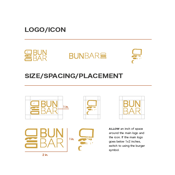
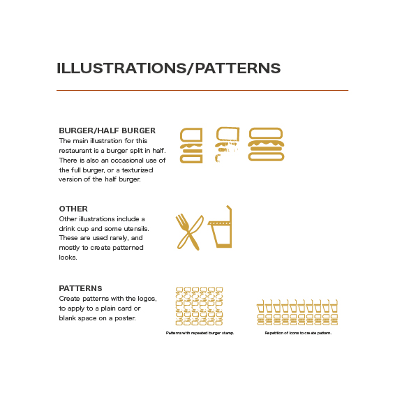
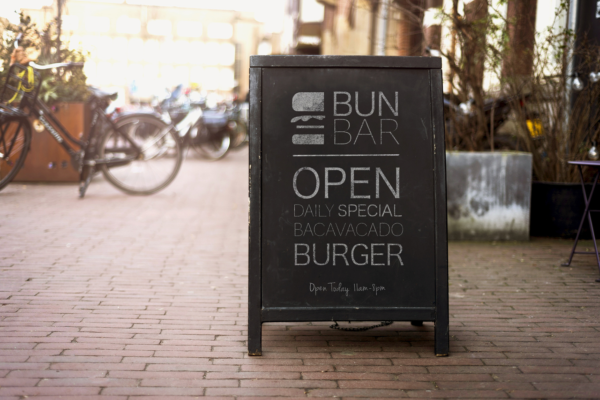
This logo was made for a coffee shop style burger lounge. The original thought was to include a burger icon in an interesting way with typography beside it. Bun and Bar stacked on top of each other just as the burger is stacked with ingredients.
TYPEFACE
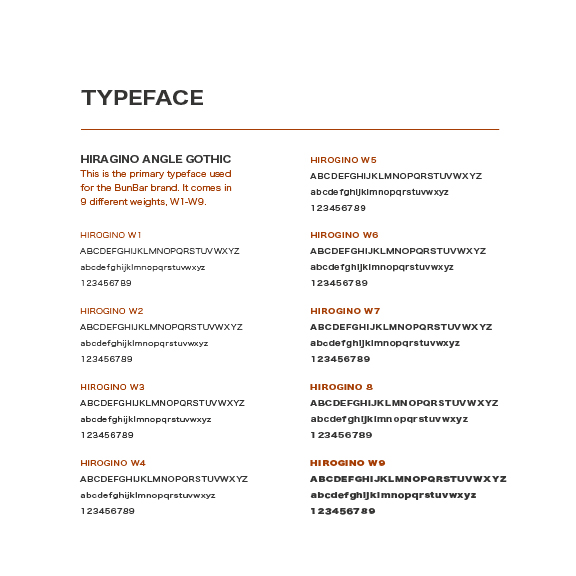
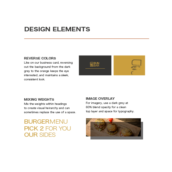
I wanted a serif typeface that was clean and allowed for different weights throughout the branding process. I chose this simple family to look consistent on a menu and other advertising products within the restaurant.
COLORS
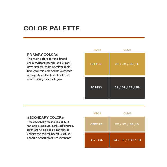
For this color palette, I wanted dark grey and a pop of wood-like color to go along with the interior of the restaurant. The interior would ideally be plain chalkboard-style walls with wood accented tables, platters, and signage.
Ultimately, people tend to look to biology and living organisms as an inspiration for their art. If we reverse that, biologist are inspired by art and and then can apply that creativity within their day to day lab setting.
Bio Design is the combining of the art field and the science field of study. Biologist communicate with artists to create something both unique and beautiful, as well as experiemental.
Microbial Art is the process of scratching bacteria onto agar jelly and creating a masterpiece to your liking, however, you have to know a bit about science, and a bit about art to master it.
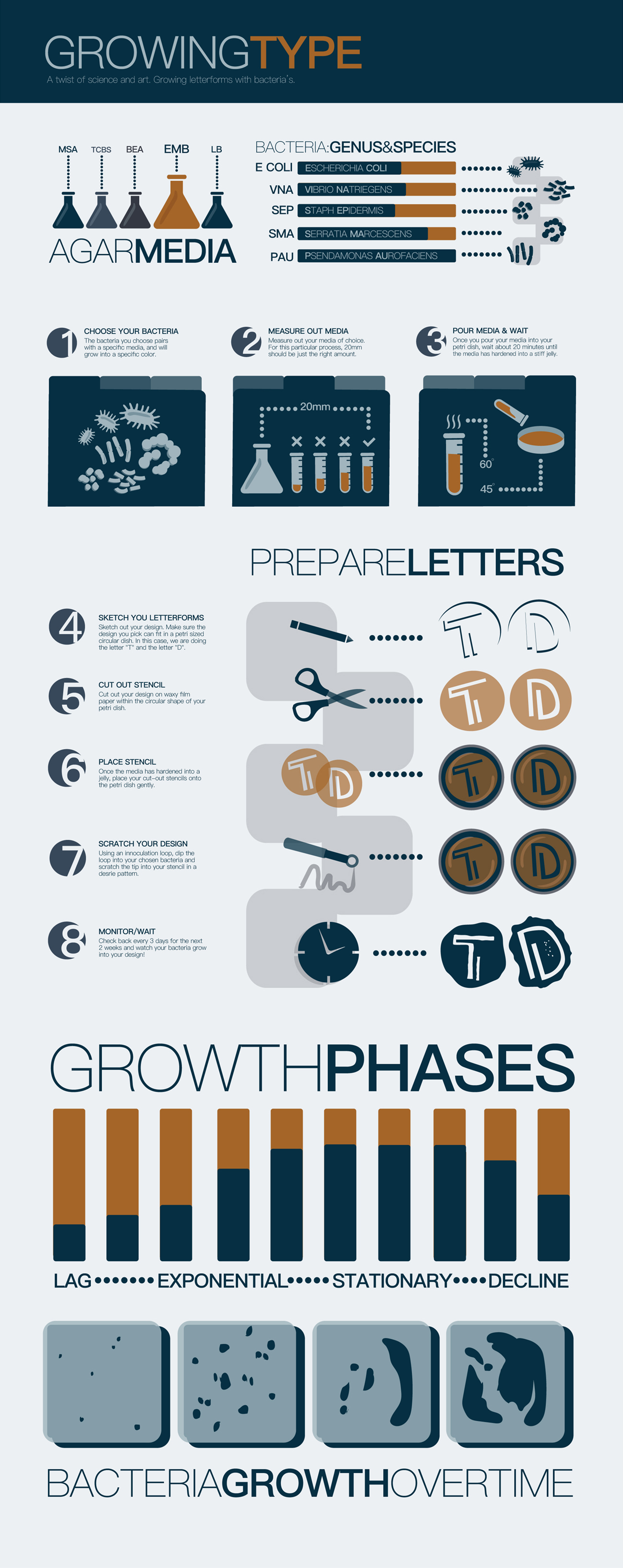
Our challenge for this project was to design our innitial and grow them out of bacteria. After experimenting, we were to create an infographic to discuss our process.
Sketch out your design. Make sure the design you pick can fit in a petri sized circular dish. In this case, we are doing the letter “T” and the letter “D”.
Connect with a biologist and figure out what bacteria’s pair together with agar to create the colors you want. Show them your design idea, and they will show you how to begin the scientific process.
Test out different bacteria’s with different agar media. The color you want depends on the combination of the two. Divide petri dishes into sections to test these different combinations.
While your agar is cooling off and forming into jelly, trace your design onto red waxy film paper and cut it out to fit in your dish. Make sure to label this stencil,
With an innoculation loop, dip into your bacteria and scratch it within your stencil cutout. You won’t see anything, as the bacteria isn’t visible in this form.
After 2 weeks, your bacteria will have grown in just the parts within your stencil. Some growth rates are faster and stronger than others. In this case, the letter “D” is barely visible.
INFOGRAPHIC
For the infographic portion of this project, I created several icons that represent the utensils we used during out experiment. Such as bacteria, petri dishes, measuring beakers, loop tools, scissors, etc.
I chose to go go from step by step as well as provide basic information about the bacteria used, general bacteria growth, as well as the different phases they go through. The idea is to appeal to a wide range of people, even those with little scientific knowledge.
NEED DESIGN HELP?
Design is a passion of mine, and I would love to share that passion with you and your company. Contact me today with inquiries on any of your design needs!