Making Complex Benefits Clear for University Employees
Designed a clear, visually structured benefits guide that simplified complex information, improved readability, and aligned seamlessly with Loyola University Chicago’s established brand system.
01
CHALLENGE
Loyola’s benefits materials were thorough but difficult to navigate in plain text. Dense content made it hard for employees to quickly find key information, especially during enrollment. HR needed a clearer, more readable guide that aligned with the university’s brand.
02
SOLUTION
I redesigned the guide to prioritize clarity and structure. Information was organized into clear sections with strong visual hierarchy. Layout, typography, and color were used intentionally to create a clean, brand-aligned experience.
03
IMPACT
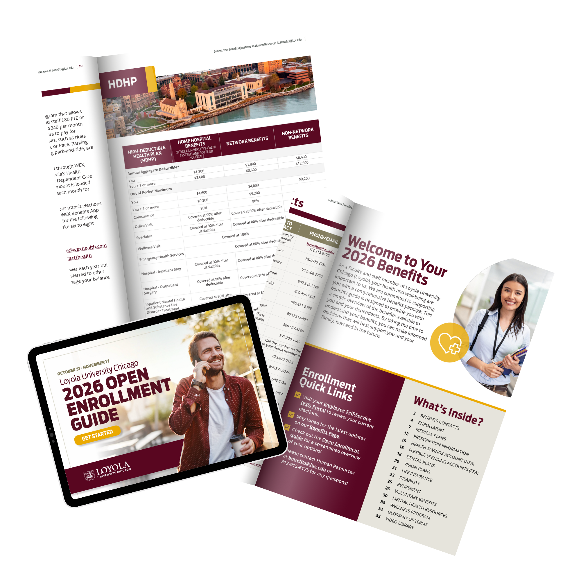
What was once a basic Word document became a fully branded collateral piece that felt cohesive with Loyola’s broader communications. Employees could understand their options more quickly, and HR gained a polished resource that could be reused and updated year after year.
The Outcome
Clear, reliable references employees can return to anytime.
By visually organizing information and aligning it with the University’s branding, the guide makes complex benefits easier to understand while maintaining a cohesive, professional look across all employee communications.
The open enrollment guide distills critical deadlines, changes, and action items into a focused, easy-to-scan format. This piece helps employees quickly understand what’s new, what’s required, and what steps to take—reducing confusion during a high-stress enrollment period.

Tori Dahlberg
When the world is quiet, ideas come alive. Each piece here reflects countless hours of curiosity and creative energy.